Thanks for your interest!
We will be in touch soon to answer all your questions.
The Qualia logo includes two variations for use with light and dark backgrounds. In most cases the logo should be used on a white background for added clarity. In cases where the logo must be placed on a dark background, the inverted version is available for use. Please avoid using the inverted logo with a strongly saturated background color.
Qualia’s mark can be used in cases where the brand name can be implied by the placement context, for example with profile images for Twitter or LinkedIn. Be sure to use the vector files included in our press packet for the most accurate reproduction quality.
When using our full logo be sure to leave spacing of one half of the Qualia mark’s size between other content or—in print—the edge of the page. When using our mark, it’s best to leave at least 20% whitespace on all sides.
The minimum size of our logo and mark when used digitally is 85px and 28px wide respectively. When used in print, the minimum size for our logo and logo mark is 1.25in and 0.25in.
Our logo consists of three colors: De York Green, Mako Black, and White. Ocean green is an additional color that can be used with page elements like buttons, dividers, or headers to show emphasis. Nevada Grey can be used as a secondary accent color with page elements. Mako Black, Nevada Grey and Shark Black can be used to add depth to text and backgrounds.
Our brand fonts are Merriweather and Lato. These two typefaces should be used to communicate key brand messages in headlines and body text.
Merriweather should be used for headline in most marketing and digital materials while Lato should be used for subheader and body copy in all cases. Please refer to an example found below
Qualia (/ˈkwɑːliə/) is pronounced with a sound similar to “Quality”, and dissimilar to “Quail”. Qualia is a single word and the letter Q is always capitalized.


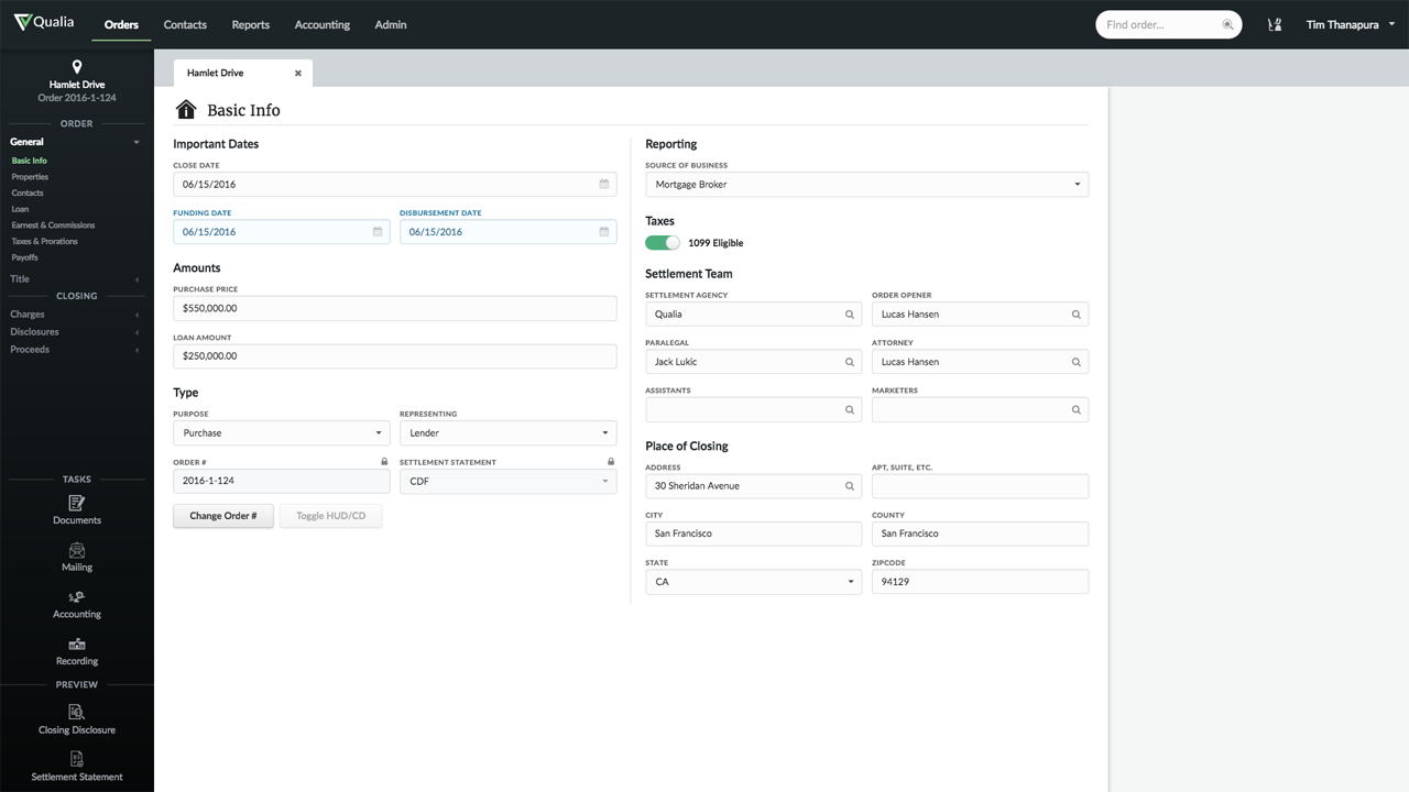
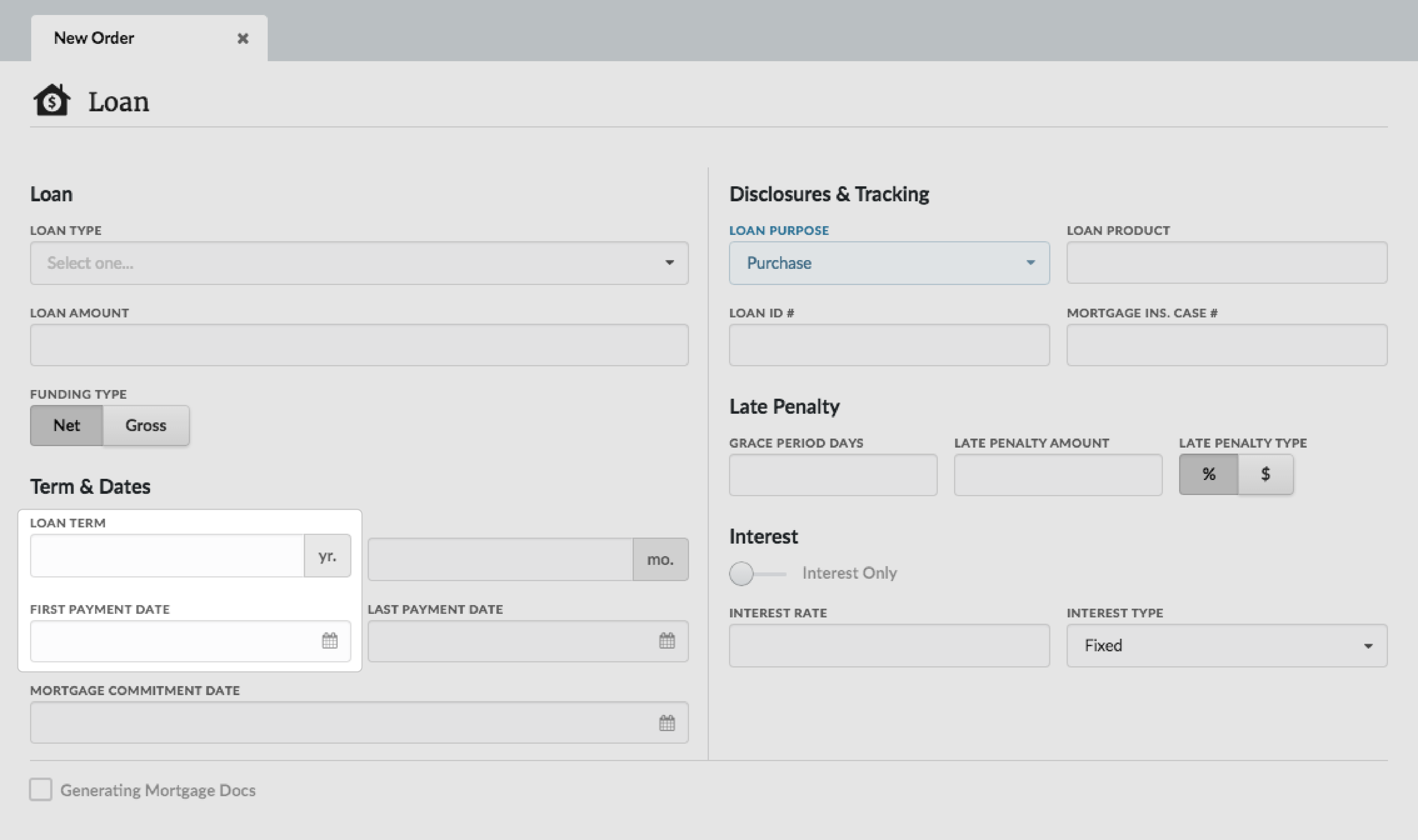
You should use unaltered screenshots for instructional purposes. Unless a photo is zoomable, do not scale the contents of screenshots for display. Please consider how much screen context is necessary to present our product. If necessary, you can use selective dimming to focus attention on a specific UI component while still revealing it’s surroundings. Try to keep some spacing between UI elements and the edge of the screenshot.
In general, please don’t edit or change our logo and please don’t use our name, logos, or screenshots in ways that may be confusing, misleading, or suggest our sponsorship.